Loblaw Digital
24Hr Hackathon
This case study was focused on a project designed for Loblaw Digital, with the aim of determining what the future of online grocery shopping might look like at Loblaws.
Role: Sole UI/UX Designer
Timeline: 24 hours
Tools: Figma, FigJam, Google Docs, Zoom
This project was a true team effort!
With lots of coffee, 3 software engineers, 2 data scientists and 1 UX designer (me!) we worked together to create an innovative, user-centred design in 24 hours!
Research and Discovery
Exploring the Problem Space
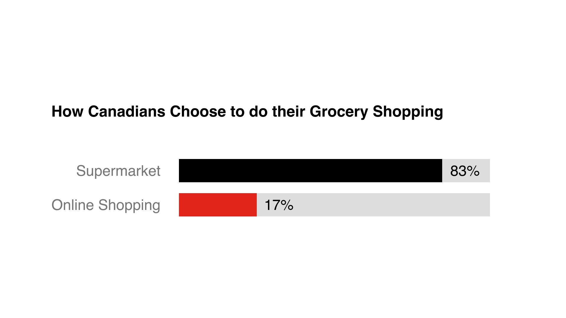
In this step, our research revealed the majority of Canadians (83%) choose to shop in-store instead of online citing the additional costs associated with ordering online.
Loblaws
Current State
In its current state, Loblaws online grocery shopping doesn’t separate itself from any other online grocery shopping brand. In order to incentivize users to use the online shopping option at Loblaws, we need to provide the users a service they wouldn’t find in store or on any other platfom. Based on our research, this solution should surround saving users money.
Reframing the Design Problem
To guide our team with possible ideas and solutions, we authored the following HMW statement:
How might we help Loblaws users find the cheapest options in order to help them stay within their grocery budget?
Due to the 24 hour time constraint, we weren’t able to do extensive research, however we did create a short survey with 5 open ended questions. We received 18 responses in return, from which created this proto-persona. This was our guiding light throughout the rest of the design process.
Designing the Solution
Task Flow
From here, we created a simple task flow of the new MVP of the product focused on saving the user money.
Designing the Solution
The Designs
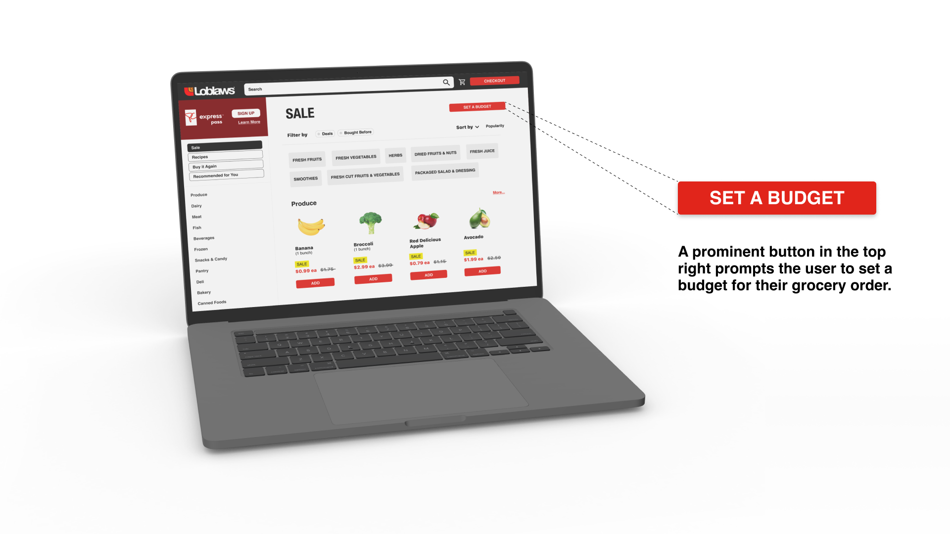
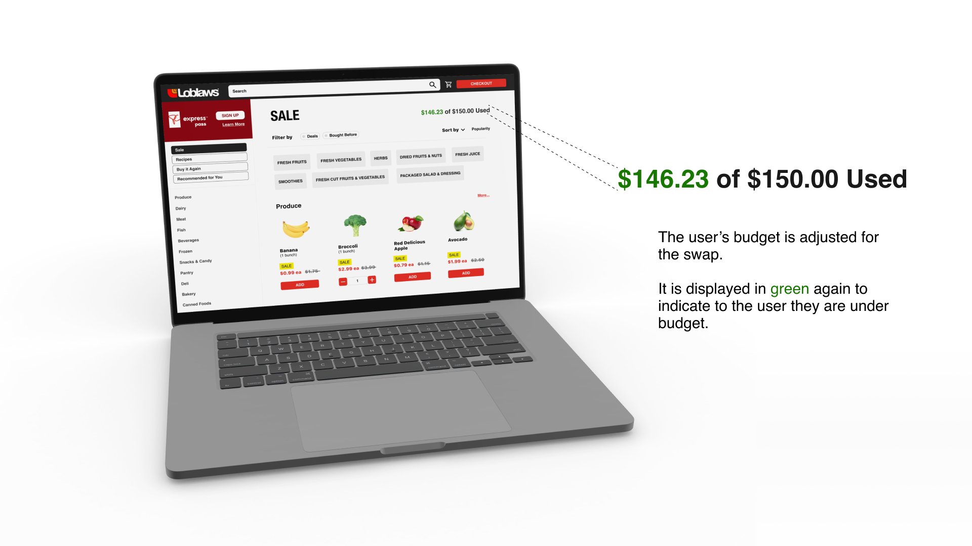
Our solution was to design a recommender system for the user, wherein the system recommends substitutions for the user to help them remain within their budget.
Step 1
Step 2
Step 3
Step 4
Step 5
Step 6
High Fidelity Prototype
See the designs and flow in full by clicking on the button below.
Wrapping Up
Key Learnings
With the 24 hour time constraint, we knew it would be best to rely on the strengths of our teammates. Being the only UX designer in my group, I relied heavily on the data scientists to conduct secondary research. Leveraging the skills of our teammates is what led us to our success.
A key challenge I faced being the only UX designer in my group was to advocate for the user and for the UX process as a whole. With the time constraint, a lot of my teammates were itching to get to the coding, but I found it necessary to explain to my group why certain steps of the design process are important.


